The blog post focuses on typography, that is typefaces, specifically those designed and created by Erhard Ratdolt (1442–1528), a Renaissance Typographer. He flourished in Venice where printing was an active and lucrative trade. The Heilbrunn Timeline of Art has an article about Ratdolt's printed work http://www.metmuseum.org/toah/works-of-art/17.45
And you can find an example here http://www.metmuseum.org/toah/images/h2/h2_17.45.jpg
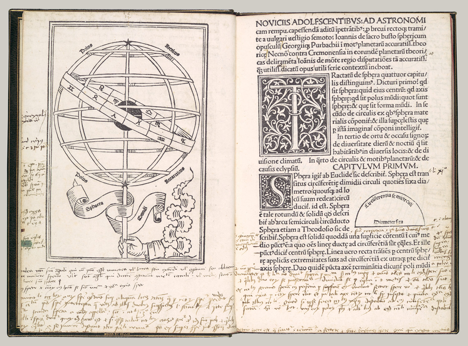
Careful examination of layout and design provide clues for how the page was composed and illustrations added. In Ratdolt's work, illustrations were either printed at the same type as the page using woodcuts that were colored later, or painted by hand afterward.
Ratdolt is most famous for printed work of Euclid http://www.sunsite.ubc.ca/DigitalMathArchive/Ratdolt/page1min.html There are not only beautiful borders framing three sides of the text, but also mathematical diagrams in the fore-edge margin, all printed at the same time.
 Here's an example of his printing where the illustrations have been colored in by hand. The caption from http://www.sunsite.ubc.ca/DigitalMathArchive/Ratdolt/ratvii.html reads "Schema zur Mondfinsternis. Holzschnitt, in drei Farben gedruckt, aus: Johannes de Sacro Bosco, Sphaericum opusculum, gedruckt von Erhard Ratdolt, Venedig 1485. Diagram, showing eclipse of the moon; woodcut, printed in three colours, from Sphaericum opusculum by Johannes de Sacro Bosco, printed by Erhard Ratdolt, Venice 1485." [To see a full size image of the page go to http://www.sunsite.ubc.ca/DigitalMathArchive/Ratdolt/ratvii.html ]
For more information on Renaissance printers, check out "Typography & Graphic Design — Renaissance to Rococo Era" (History of Graphic Arts by Paula DiMarco, Ph.D., California State U Northridge course on typography) : http://www.csun.edu/~pjd77408/DrD/Art461/LecturesAll/Lectures/lecture03a.html

